Personal Statement

A yellow poppy stands for success and happiness, that is what I intend to have.

Wednesday, April 28, 2010

Pufferbelly Depot, Adaptive Reuse


The adaptive reuse of the Pufferbelly Train Station has been by far my favorite design. Throughout the design process I was able to get a firm grasp on my concept which made it easy in the end to complete a residence, studio and gallery space that had a cohesive design. Beginning with an inspirational photo that turned into a pattern and then a spatial influencer, I am very happy with how the end product turned out. I have found out many of my design preferences throughout this process such as straight and geometric floor plans mixed with an eclectic style of furnishings and architectural elements such as columns and coffered ceilings. It seems to give a little to all preferences, those who like the frills and those who appreciate simple and geometric design. After a gruelingly long time spent in the studio to finish, I feel so gratified when I look at all the work I have done and how it all turned out.

Wednesday, March 3, 2010

Concept Development: D. Module to Concept Model


< Preliminary Sketch Models

Concept Statement:
Continuing to use the photo of the group of 1920s WSU students as an inspiration, the 3D concept model represents the longevity, togetherness and movement of people through out time. A fairly dark and neutral color scheme which was derived from the photograph, as well as the textile, is employed and represents the historic past of the photo while the red wooden dowel connects the columns and is placed in an upward diagonal represents movement and implies forward motion. The color of the dowel represents the longevity and liveliness associated with college. The three columns are of different sizes and thicknesses to represent the diversity among the students then as well as now and to enforce the theme of coming together. To tie in the textile pattern and to further the concept of coming together the columns are connected by the dowel, which acts as a commonality between them all.


Reflection:                                                                  Final Concept Model
For my concept model I knew that I wanted to incorporate the same ideas and emotions that I have been working with through out parts A, B, and C. In the preliminary model stage I wasn’t very jazzed about any of my models, however after talking them through with my presentation group I decided to make some changes and stick with the last model that I made, the one with the columns. Originally it was not in 3D, however for the final I envisioned it to be like that. I used balsa wood and a wooden dowel to create my design. I chose these materials because of their ease in use, but also what they meant to me. Wood is a timeless material that can be used for many different things and reminded me of the timeless quality of the photo, as well as everything that it stood for. The students were coming together, just as the columns were with the dowel, and that connection really inspired me to create this model. I am very happy with the way this turned out, the only thing I would change would be varying the texture in the columns to create more diversity.

Concept Development: C. Module to Textile

Reflection:
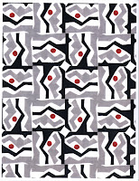
After submitting my textile to the production company, Spoonflower, I knew that I was pleased with my final design, as I had been fussing with color schemes and patterns for a while. I finally decided with this pattern that rotated the module by 120 degrees and then had them meet in the middle in a radial fashion. I did this because it emphasized the idea of coming together, one of my main focuses in the project. I decided in the end to eliminate color from the design, as my photo inspiration was black and white and it followed my concept of diversity (with the color contrast). Overall, I am very pleased with the way it turned out; I love the design and the way the design stands out against the black background, who knows maybe when this process is all over I’ll have fabric to make my self a sweatshirt!

Concept Statement:

The old photograph of Washington State students gathered on a train that carried them across the state provides the inspiration behind this textile design. The connection between these students and the current students implies the movement from past to present. While train appears to trail into the distance, there is a connection to the time these students spent at the college because it too has faded into the past. The application of this idea to the textile is apparent through the double lines that meet in groupings of three at the center of the module, and then are linked to others, allowing the mind to conjure the words of movement, connections and the transformation from past to present. The color scheme for the design was derived from the photo too, as the photo is in black and white. This connects to the idea by recognizing not only the nostalgic and historic quality of the photo, but also emotionally as white is seen as new and pure, or present and future; and black represents the distant shadows, old things already discovered, which is the past. 

Friday, February 26, 2010

Renaissance Fine Woodworking, Inc fieldtrip

The fieldtrip today to the cabinetry, furniture, and contracting shop taught me a lot about how to work with contractors to effectively create a functioning design. They talked mainly about the relationship between designer and builder and focused on the need for clear decision making and how that makes it easier to come up with an end product that both client, designer, and builder are happy with. It was very interesting to see how they worked and touring their workspace because it gave a further insight to what happens between paper and final design which I believe is necessary if you want to create a great design. Personal relationships was something that they really enjoyed making and thought was essential to a commercial business. They said that not only should the creative process of construction and design be business oriented but establishing personal relationships was imperative to keeping a business like theirs above the water and also made things much more enjoyable! Overall I would say that this visit was helpful in my design education because it showed me another side to the industry and one that I look forward to entering and making my own!

Monday, February 22, 2010

Concept Development: B. Modules to Pattern

In this second review of concept development, I narrowed down my choices of partis to use as modules in a pattern. To create a pattern I rotated, flipped, and altered them until they were placed in an aesthetically pleasing and interesting fashion. The patterns I chose to put on here were ones that I found most interesting and fitting towards my concept of movement and togetherness. The next step was to apply color, something I found didn’t work well with my design. Because the photo was in black and white, I wanted to stick with this. I tried color but all combinations I thought were overwhelming and took away from the classic beauty of black and white. I thought it also was a good way to bring the past into the future, black and white is usually something representative of an old design, yet its beauty and appreciation still exists today.


Module 2 Patterns

Concept Development: A. Abstractions to Modules


For this design my inspiration was an old photo that I encountered upon entering the Pufferbelly Depot in Pullman, WA. I instantly knew that this photo would be in inspiration because of the connection I felt to the students in the photo taken so long ago. They were there, together, for an education at Washington State, just as I am today with my peers. The similarities were there but I also loved the apparent time separation. They were dressed in formal attire, I in my usual jeans and t-shirt. From this I took not only the implied movement of the train as well as movement of time (past to present) but also the togetherness that they had as a group of students all there for education. After analyzing the photo and taking from it all of the words and implied lines that I could, I put them on paper with my own interpretation. In the modules I focused on movement and togetherness. Some lines are fluid, some join together, and others seem to recede into the distance, another implication of movement. Being early on in the concept development I simply tried to put these words into abstract drawings.


Photo Inspiration
some favorite parti sketches


Tuesday, February 16, 2010

Vision Impairment Exercise


My sketch of what the CUB looked like when I was visually impaired

When doing the vision impairment workshop it was really interesting to experience the word of the blind. It was scary almost to move around the CUB not knowing what exactly was around me like I usually do.

The floor was too bright from the glare of the florescent lights, there was no contrast between the floor and walls, or anything else really. Columns blended in to the walls, people blurred together, and machines and other things used on a daily basis became great obstacles that I have to maneuver through and around. I think a lot more could have been done in the design to make our world more accessible to people with visual impairment, after all most people have failing eyesight at some point in their lives.

With out everyone being able to interact in the built environment we lose a sense of diversity and people with vision impairments become irregular, or strange. If everyone with a disability was able to function properly in our built environment, imagine the possibilities of our world... There would be so much less discrimination due to peoples physical abilities. This was really helpful and I feel it will help me create a place more suitable for a visually impaired person in my depot design.